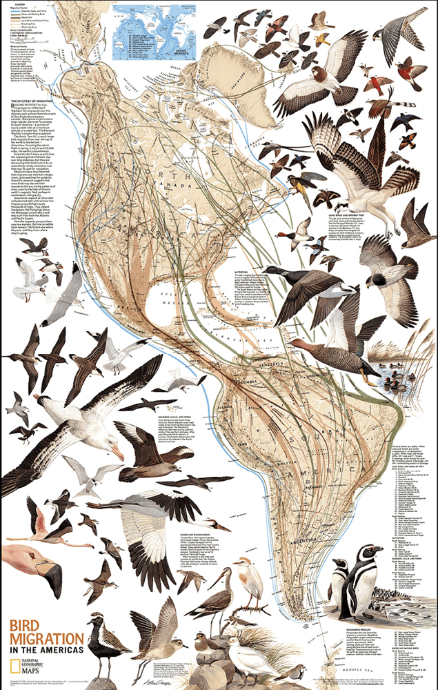
This is National Geographic‘s map of the migration of birds throughout the American continents. Now this is a screenshot from Dr. Joe Burrascano’s presentation on newer ImmunoBlot tests that IGeneX has developed. (The upper map in green is an incidence map of Borrelia burgderfori.)Likewise, this is a screenshot of another video (watch the full video below) that goes through IGeneX testing.
It shows that they are watching the spread of many tick-borne infections. But as a start, I only wanted to look at Borrelia burgderfori, so I clipped out that map.
IGeneX’s incidence map of Borrelia burgderfori in 2020.
Then I laid the Nat Geo’s map over IGeneX’s map — and, well — see for yourself:
Superimposing the two maps shows clearly that there is a correlation between where birds go and where we see tick-borne infections. Moreso than deer, birds are the #1 way ticks get around.
Those maps match up extremely well.
(Here is the video that explains some of IGeneX’s tests. )